For many, September marks the start of the new school year after what was, hopefully, a refreshing and re-energising summer break. We know that the first few days and weeks of the autumn term can be a mixture of anxiety, nerves and excitement – for teachers as well as pupils!
So, whether you are one of those teachers who has your classroom totally set up and September-ready before you finish in July; you sort it during the holidays; or you wait until the INSET days in September, we all know that the learning environment we create is important in so many ways.
What makes an effective classroom/learning space?
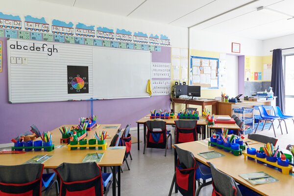
An effective classroom/learning environment is important for the children, adults and visitors working within that space and should:
- • Be an inviting indoor space – one that is free from clutter and easy to move around.
- • Be a calming space that everyone feels is 'theirs'.
- • Have a planned layout, with distinct zones e.g. a reading nook, a creative area and individual/group tables.
- • Have clear displays and working walls, showing learning journeys and vocabulary growth.
Display Boards – 'To Be (bold) or Not To Be'
First and foremost, deciding how to back your display boards may be a matter of school policy.
Traditionally, many primary schools have favoured bright, bold colours for backing paper and borders as a way of making the classroom space appear more engaging, inviting and vibrant – especially in Early Years and KS1. But, more recently, there has been research to suggest that muted, natural tones are better for creating a calm environment with less distractions – especially for children with specific SEND conditions and/or sensory difficulties.
Go Au Naturale!
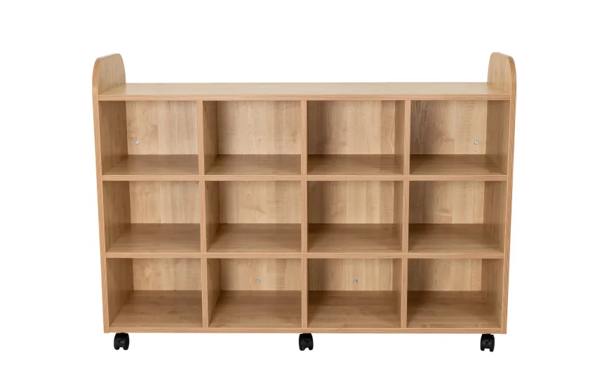
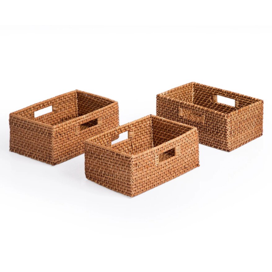
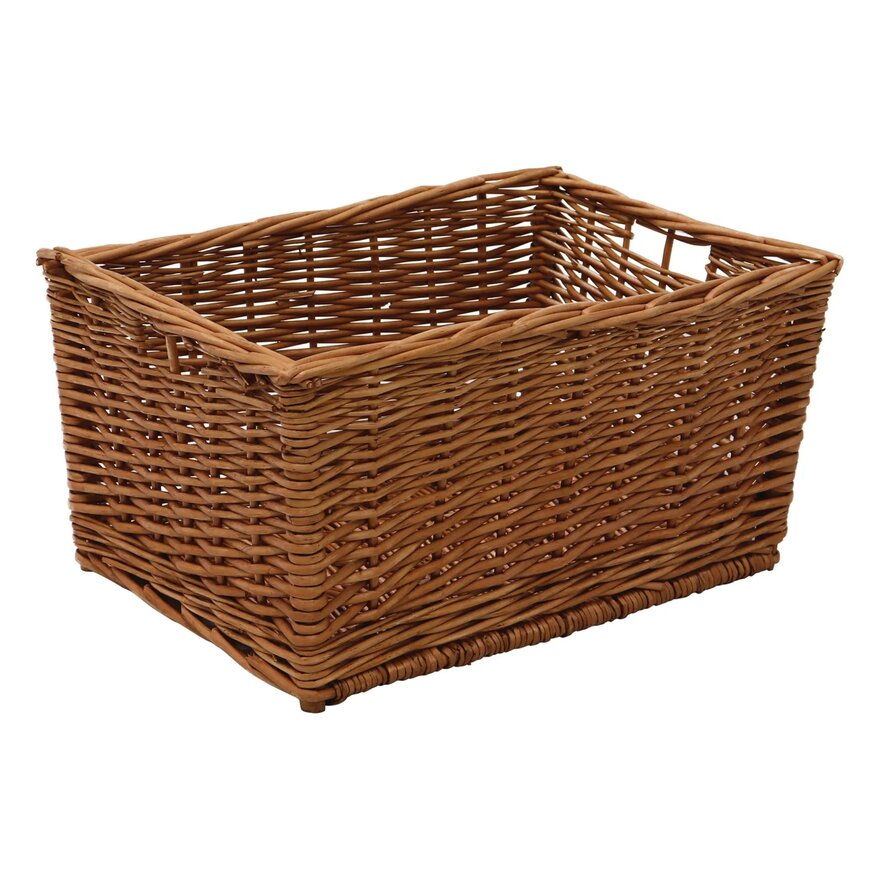
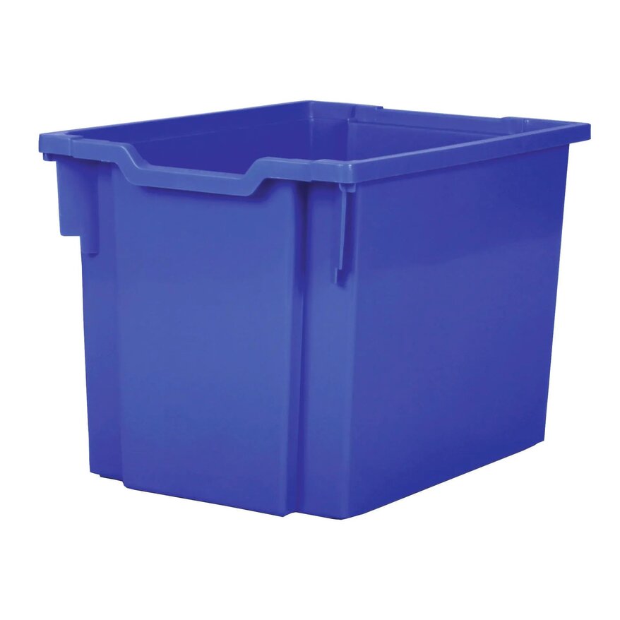
You could use natural storage (e.g. wood and woven baskets) or muted tones so that the brightly coloured resources (e.g. construction blocks) are even more eye-catching.
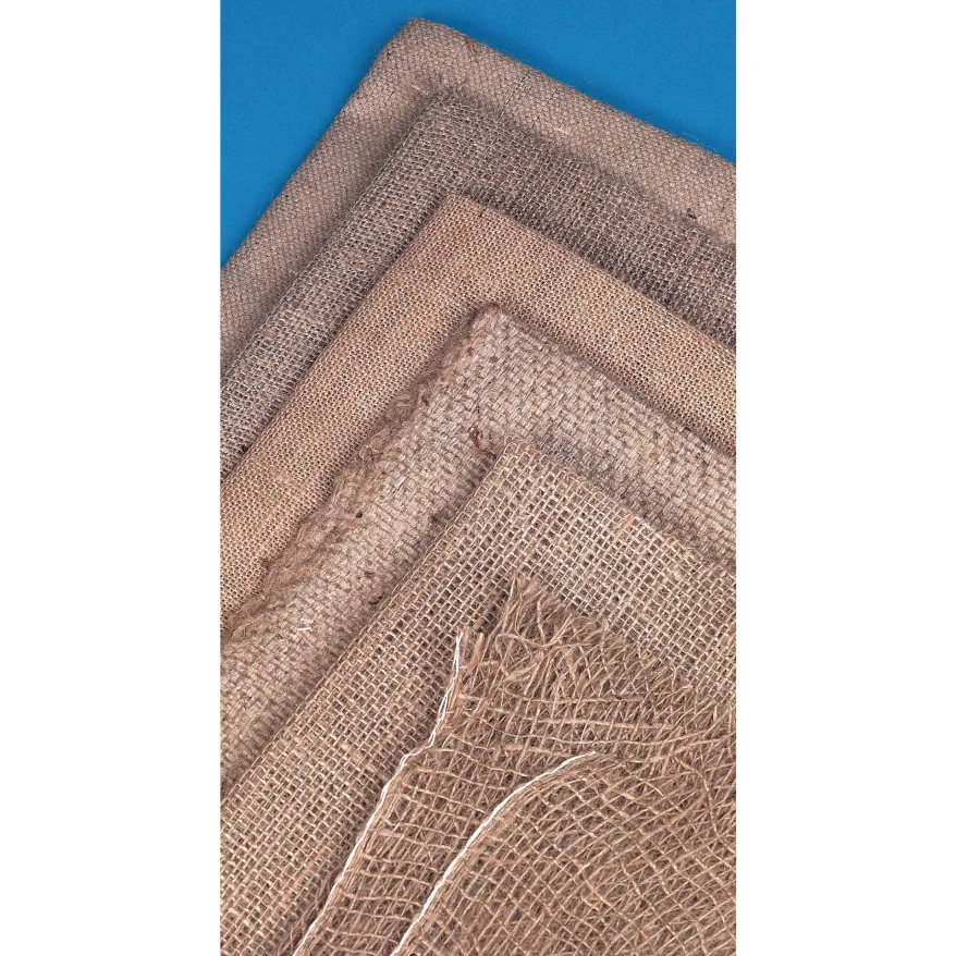
This type of storage will also add to the overall environment by offering a different texture, look and feel to the classroom. Neutral backing can make the children’s work stand out even more – especially if they have used lots of colour. Likewise, for working walls, the key information will then be displayed in a clearer way. You can also accentuate this further with plain borders e.g. white or natural. It is also a nice idea to add other subtle natural effects to enhance your displays further, for example, using ivy garlands and/or hessian for texture.
Environmentally-speaking and budget-wise (always a consideration for schools), using only neutral colours for displays could reduce the number of times that the backing needs changing – which is a win for everyone…. environment (less paper), less time (teacher/support staff) and budget (overall school). It could also reduce the bun fight that can ensue when someone gets all the ‘best’ backing paper first!
Sticking to one colour ...TOO 'Plain Jane'?
Check the space from every angle
Check the space from every angle
Once you have arranged your tables and chairs, take time to have a quick sit in each space with your interactive whiteboard on. You can then see what it is actually like to sit in that seat from each child's perspective. If you need to turn your body at a strange angle, notice glare from the classroom lighting, or there are any distracting features, you can rectify this before the children start. This might sound excessive, but putting in this effort now could help reduce behaviour and off-task issues from the beginning of the year.
Please remember that however you set up your classroom, whether George Clarke level of interior design or maybe something slightly less (!), you are the most important resource for those children, so take care and enjoy the new term! 😊

